Color Strategy
Color Strategy Guide: Stop Guessing, Start Controlling Your Dress Game
Most people treat color like a last-minute choice. That’s why their outfits look average. Color isn’t decoration—it’s strategy. If you’re not using it deliberately, it’s working against you.
For both men and women, color in dresses decides visibility, authority, and overall perception within seconds. The problem is simple: people choose what they like instead of what actually works.
Start with the biggest misconception—“safe colors always work.” Black, white, and neutrals are overused because they feel reliable. But here’s the reality: they only work when everything else is right. A poorly fitted black dress still looks bad. A dull white outfit without structure looks unfinished. Safe colors don’t save weak styling—they expose it.
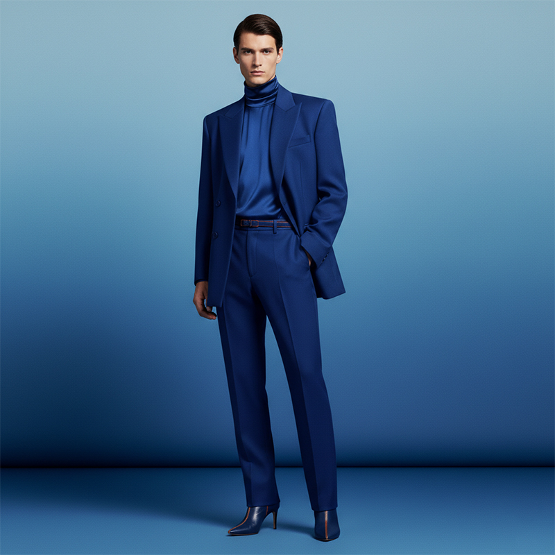
Now understand the contrast. This is where most outfits either stand out or disappear. Low contrast—like similar shades—creates a subtle, calm look. High contrast—like dark and light combinations—creates sharpness and attention. Men often ignore this, ending up in flat, lifeless outfits. Women sometimes overdo it, creating visual noise. The balance depends on your goal: do you want to blend in or stand out? Decide first, then choose colors.
Next is skin tone alignment. Ignoring this is a common mistake. Certain colors naturally enhance your appearance, while others make you look washed out or harsh. Warm skin tones work better with earthy shades, deep reds, and warm neutrals. Cool skin tones respond well to blues, greys, and sharper contrasts. This isn’t opinion—it’s visual science. If your dress fights your natural tone, it will never look right, no matter how expensive it is.
Then comes color dominance. Every outfit needs a clear leader. One color should take control, while the others support it. Men often fail here by mixing too many similar tones without hierarchy. Women make the opposite mistake—too many strong colors competing for attention. The result in both cases is confusion. Keep it simple: one dominant color, one supporting, and if needed, one accent.
Context matters more than preference. Bright colors during the day can work well, but the same shades at night may look out of place. Dark tones often perform better in formal or evening settings. A vibrant dress in a serious environment can feel distracting instead of stylish. The point is not to avoid bold choices, but to use them where they make sense.
Fabric also changes how color behaves. Matte fabrics absorb light, making colors look deeper and more controlled. Shiny fabrics reflect light, making colors appear louder and more noticeable. A red cotton dress and a red satin dress do not send the same message. Ignoring this difference is a mistake.
Finally, stop copying what works on others. Color is not universal. What looks sharp on someone else may fail completely on you due to differences in tone, lighting, and overall styling.
If you want your dresses to work, treat color like a tool, not a guess. Control contrast, align with your tone, define dominance, and match the setting. Otherwise, you’re just hoping it looks good—and hope is not a strategy.
Trending Now

Men's Slim Fit Formal Trousers/Pant
Rs.543.00

Men's Slim Fit Formal Trousers
Rs.707.00
Men's Regular Fit Pants
Rs.544.00
Men's Slim Casual Trouser
Rs.800.00
Men's Slim Fit Checkered Trouser
Rs.499.00

Textured Stretchable Trousers for Men
Rs.899.00

Men's Regular Pants
Rs.2,344.00